So, I've been on the site for a while now, working with tutorials, playing games, watching movies, listening to some sweet tracks... and of course I've been working with Flash every day since I joined. I've gotten down some basics, brushed up on some things I'd gotten rusty in, and I'm happy to announce that I am currently working on a whole music video!
Yes, a music video. It's to the song "It Doesn't Matter" from Sonic Adventure 2 and it stars none other than Shadow The Hedgehog! Yeah, that's right, Shadow. No, he's not going to be all emo in the video either. Sorry to dash any hopes of emo jokes, folks. I just think the song fits him now since he put his past behind him and is pretty much living in the now after the events of his game and I decided I want to show a slightly lighter side of my favorite hedgehog. (Sorry, Sonic. You're my second.)
The style of the video itself is going to be a mix of animation and artwork drawn in Flash and sprite animation. I know you're now probably thinking "This thing is going to be a hot mess," but trust me, I'm using the mixture of styles to the best dramatic effect possible to ensure optimal awesomeness. And, to answer the question I know is on some of your lips, it's going to be 100X better than "Anderivalda's Victory" both art and animation wise. That film was made in 2005, it is now 2009. I've become a way better artist in general since then and have learned a lot more about animation techniques as well.
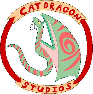
In other news, I have made a colored version of my Studio logo. Due to not saving the image properly, however, it came out grainy and will need to be recolored, but you'll see this initial picture at the end of this post anyway. The better version will be appearing in my custom preloader(s) and in the credits of my films.
Hope you enjoyed this issue of CatDragon Studios Coming Attractions. Now, I leave you with V.1 of our lovely studio logo!!

mongoid
That logo needs some serious cleaning up.
Why don't you use a font instead of writing out the letters yourself. And the green scales with pink stripes is a bad choice in color. I hope this isn't your final draft.
LycanDiva
No, it's not my final draft. I did the letters myself because I like the character of my own lettering on the logo better than any plain old font, since it just feels more personal. On the colors, I actually like the light green and pink together so those are the final colors, along with the red circle and lettering and the yellow banners. So, the lettering and colors are going to be the same in the final draft, I just need to fix the quality...which means retracing the drawing because I only saved the .gif, not the .fla file I had worked for about 2 hours on. -_-;